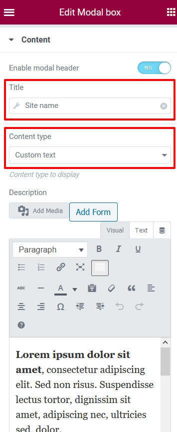
With the Modal Box Component for Elementor you will be able to display multiple different content like a Custom Text, Video, HTML page, Elementor Template or Form.
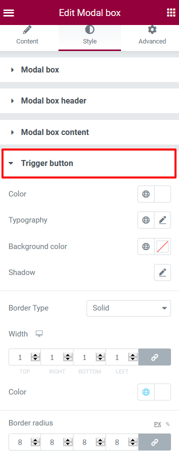
Those content could be displayed with different trigger like a Button, Image, Text or automatiquely after the page was loaded.
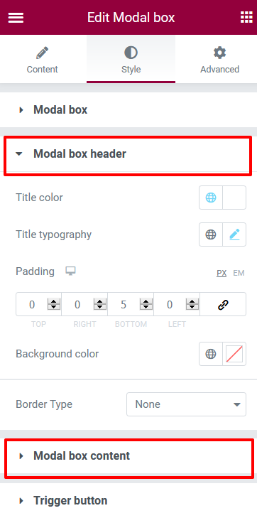
Each content and trigger can be customized
You will find full examples following this link
Table of Contents
Accessibility for modal box widget
Keyboard and screen reader accessibility
Enter / Space keyboard keys on button/text to trigger the modal box
aria-label text 'Open modal box + title of the button/text
aria-expanded to indicate whether the modal box is expanded or not
aria-controls to identify the HTML tag whose contents are controlled
aria-haspopup equal 'dialog'
Tab keyboard key inside modal box to move between links
Enter / Space keyboard keys inside the modal box on close button (X) to close the modal box
Escape keyboard key to close the modal box
System Requirements
Elementor free version and Elementor-addon-components are installed and active.
How to configure modal box Content
- The header can be toggled on or off with text or by using a “Dynamic Tags“
- Content to show: you can choose different type of content, video, Google Map…
- Link: you have to set a full URL link. The content will be loaded in a ‘iframe‘. Keep in mind, that due to same origin policy, there are some limitations.
- Custom Text: add the text with some HTML tag like a button
- Form: add the shortcode from any form builder
- Elementor template: choose from the list the template you want to display
How to configure Trigger Options
- Trigger: you can choose different type of trigger, Button, Image, Text or after the page is loaded
- Button: add a pictogram before, after the button text. Specify his size and alignment
- Image: choose image from the library or a external image using “Dynamic Tag Media”
- Text: simple text or Dynamic Tags to trigger a popup
- On page load: when should the popup appear after the page load
Styling the modal box
Choose how would you like the modal box to appear on the screen.
You can choose the modal box itself, his header, his content and styling the trigger.
Add your own CSS under Advanced Tab/EAC custom CSS
- Modal box: add a color, a background image and apply a blend mode
- Modal box header: not available with ‘Link‘ content type
- Modal box content: only available with ‘Custom Text‘ content type. You can set text color and his typography
- Trigger XXX: each trigger have his own section style. Button in our example where you can style it
- EAC custom CSS: add your own custom CSS to style the trigger
How to add a button in the footer that opens a form in a modal box
- First you have to build your form and copy the shortcode
- Create an Elementor Section Template
- Insert the Modal Box widget
- Choose ‘Form’ as content with ‘Button or Custom text’ as trigger
- Paste the Form’s shortcode into the requiered field
- Save and exit the template
- Copy the template shortcode
- Go to ‘Appearance/Customize’ to modify your theme
- Add a new widget (Custom HTML) in the footer and paste the shortcode from the template