Display ACF gallery field using a Gutenberg block

Simple Gutenberg block to display a free‑version ACF gallery field in a fully configurable grid—no code required.
The block lets you select an ACF Gallery field, set columns, spacing, alignment, and image order, and choose link behavior (file or image) and captions. It outputs a responsive, accessible markup (alt attributes, semantic elements) and works seamlessly in the visual editor.
Documentation covers installation, adding the block, selecting the ACF field, presentation settings, and sample CSS for custom styling. Perfect for quickly adding ACF galleries to modular layouts.

Enable the ACF gallery field and gallery block

The ACF plugin is installed and active.
The EAC components plugin is installed and active.
In the dashboard select EAC components link and Features tab then enable the ACF gallery field entry.
After that select the WordPress tab and enable the ACF gallery block option and save settings.
Now you are ready to build and display the content of a gallery field.

Create a gallery field

You need to know how to create a field group and associated fields, as well as how to define the rules for associating them with publications.
After creating the field group, select the EAC gallery option in the Content section. You can then create the location rules and save change.
You can also use the ACF Option pages to make your Gallery global to your site and not attached to a particular publication, post type or template. To use Option Pages follow this link.

ACF create gallery field
Select the EAC gallery entry from the content section

The gallery is created. You can fill in the field relating to the publications targeted by the location rule defined previously.

Select the gallery source

In the block editor, search for the EAC gallery block and drag and drop the icon into the preview panel or /eac in the preview.

In the Settings tab, Source section, select the gallery’s origin: either the current publication or another publication by its ID, especially if you have enabled ACF’s Option Pages then select the gallery from the list.

ACF gallery block source
Galleries source

Configure the layout mode

From the Layout section you must select the number of columns per row for each device (Responsive).
You need to specify caption level or simply wrap it in a DIV tag (Default).

ACF gallery block layout
Configure the layout mode

Configure image

In the Image section, select the best image quality and optionally apply an aspect ratio.
You can add the description using the “Add description” option, which adds the content from the attachment’s Description field.

If the Description field is empty and the attachment is linked to a post or WooCommerce product, the post exerpt or the product’s long description field will be used as the content.
You can also open the images in a viewer by enabling the “Lightbox on image” option.

ACF gallery block image
Configure image

Configure link

In the Link section apply the URL globally to each item if option ‘Lightbox on image‘, section ‘Image’ is disable and enable ‘nofollow’ to prevent the target of each link from being tracked and indexed by search engines.

The link construction is automatic; either the attachment is linked to a publication (Uploaded to column of the media library), then the URL will point to that publication or you have created an ACF field group (URL, Link or Page link) with the location rule “Attachment”, then this link will be used as the URL.

Configure link

Configure text alignment

The title and possibly the description are positioned within a flexbox. Therefore, you must define their horizontal and vertical alignment by opening the settings context menu in the top bar. Horizontal alignment supports RTL languages. You can also define alternative grid widths using the icon on the right.
ACF repeater block alignment
Horizontal and vertical text alignment

Configure the spacing

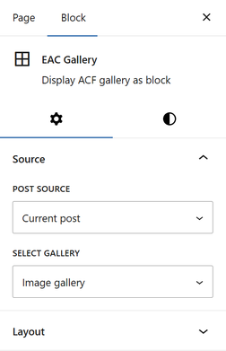
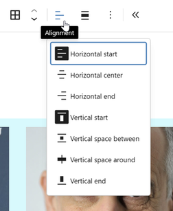
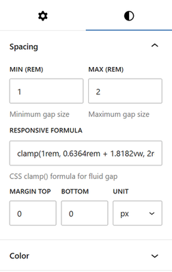
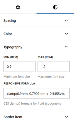
In the Styles tab, under the Spacing section, you can define the gap between items that will adapt to all types of devices.

To do this, you must determine the lower and upper limits (Min and Max REM units) so that the block calculates the optimal gap relative to the viewport (320px to 1200px). The CSS formula (clamp) that will be used is located in the field Responsive Formula.
In addition, you will need to specify the top and bottom margins to be applied to the block, if applicable.

The padding is automatically calculated based on half the result of the Clamp formula.

ACF repeater block spacing
Configure the spacing gap and margins

Configure typography

In the Styles tab, under Typography section you can define a fluid font that adapts to all types of devices.
To do this, you must determine the lower and upper limits (Min and Max REM units) so that the block calculates the optimal font size relative to the viewport (320px to 1200px). The CSS formula (clamp) that will be used is located in the field Responsive Formula.

ACF repeater block typography
Configure the typography

Other styles

Two other sections: Color, where you specify the background colors of the block, the background color of the items, and the text color; and Border item, to apply a predefined or custom style to each item.

Use the Advanced section of the settings tab

In the settings tab, Advanced section define the CSS to modify the behavior of the field’s content.
Each field generated by the block is associated with a specific class, always formatted with:
“acf-gallery__caption” for the title
“acf-gallery__description” for the description
From there, by adding your own class, you can modify the design of a field.

.your-own-class .acf-gallery__caption {
    align-self: center;
    font-size: 18px;
    font-weight: 500;
    color: blue;
}

Leave a Comment